
Jhereg's Impromptu Pose/Coloring Tutorial (Using Photoshop 6.0)
This tutorial is mainly for people with Photoshop 6.0. Though 5.0 is very close and can probably be adapted very easily. I myself upgraded to 6.0 and promptly forgot all my 5.0 stuff when I learned the 6.0 way... so (smacks self) sorry about that...
This tutorial also treats the reader as though they have already read the basic shading and coloring tutorial on Wolhome:
http://wolfhome.com/faq/submit/index.htm
1) The first thing that needs to be done is to draw your picture/pose. I can't really help you draw, that's all you, but I can help after that. ;) You can do this either on paper and then scan it in gray scale, or draw it in another program vector or raster. I tend to lean towards drawing my poses in vector, so the scaling doesn't lose detail, but there are plenty of people out there that draw directly in Photoshop or PSP or even the evil MS Paint.
When scanning hand drawn art, I tend to use 300 - 400 dpi on a flatbed scanner and scan as GrayScale
1a) Cleaning up Scanned Art
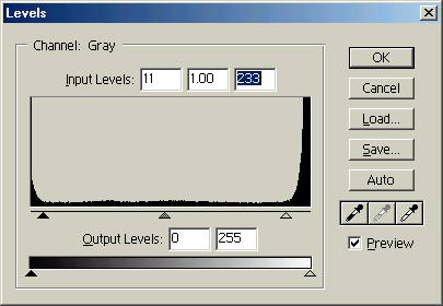
First things first. You can't very well have a pose that has grid lines or eraser marks or even paper particles scanned in as your master, or you're coloring will go MUCH slower. Use Levels in Photoshop (either by using the menu > Image >Adjust > Levels (Control-L) or by making a Levels Adjustment layer using Ctrl and the middle icon at the bottom of the layers palette.
When you scan in line art, there is often scanning "debris" that shows up on the levels as the two humps at the beginning and at the end of the levels windows. By sliding the arrows at the bottom over towards the "end" and "beginning" of the humps, you can rid yourself of the "gray" of the paper, etc. By checking the Preview box, you can watch your adjustments as you do it. Be aware that the farther you go "inward" the more you lose finer details. Some lines get darker, but some lines will disappear if you are not careful. Using the preview will help you "eyeball" the cleanest adjustement. If you use the "auto adjust levels" option, you may or may not get what you want.
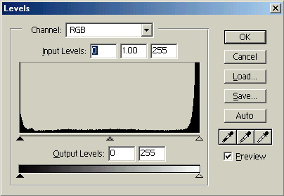
To clean up scuff marks and other such debris that may or may not be the scanner, you can make the foreground color white and paint over the rebellious marks with the paintbrush tool. You can also select the area with the lasso tool and fill it with white using ALT-DEL.
2) Making the Layer of Line-Art
The goal in this is to make one layer that has only your black lines on a transparency. Thus the only thing opaque in your drawing is your line art.
Any of you that have taken the paint bucket and filled an area to see the lovely gray anti-aliasing "halo" around your lines probably know the evil that is anti-aliasing, whether you start from scan or from vector to raster export.

If you want to make those evil gray pixels go away, here is the way I do it:
Goto your Channels Palette and you see all of your color channels highlighted (and if you are in grayscale mode from your intial drawing scan, there should only be one channel... GRAY) . Click on the "Load Channel as Selection" button at the bottom of the palette. Invert the selection using CONTROL-SHIFT-I to change the selection from the white colored areas to the black colored lines.
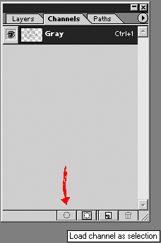
Going back to the Layers Palette click on the New Layer icon to create another layer.
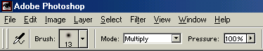
Then fill the selection with black (press "D" for your default colors and then ALT-Delete). In the list that pops up for blending modes (in the layers palette, choose multiply) or take a paintbrush and run over your entire canvas into the selected area with the brush setting set to Multiply and your color set to black. Either works. The Point is to fill in the entire selected area with solid black.
Deleted your original (unblackified) layer scan layer (usually named "Background") or keep it. It is up to you.
You should now have one Layer (and with or without background). Name it. I usually call it "Line Art".
Coloring (woohoo)
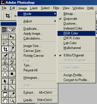
Take the gray scale image and convert it to RGB. Duplicate your Line Art Layer 2 times. Name each layer something different.

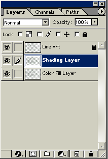
When I work I have at bare minimum 3 separate layers. All original duplicates of my first "line-art" layer. I name the first layer my "Line Art" layer and lock it by checking the little box next to the lock symbol. The second layer is my "shading" layer which I use to do most of my coloring work. The third layer is my original color fill layer that contains the broad color fills for each section to be colored. Once I make the fills, I lock that layer as well so only the shading layer is free to be edited. This allows me to select sections via magic wand tool via either the mass color areas or the spaces in between the line art. Sometimes one works better than the other, but you don't know when until it comes up as an issue.
Photoshop magic is all about channels and layers. In this case, it is mostly about layers and more layers. Layers save you from "oopsies" just as much as undo and snapshot. If you want to work on one area that might look awful or might look great, clone your layer and test it on the new layer. That way you don't mess up the parts you do like. Hey if it turns out awesome, go ahead and merge down your layers. The key is to have layers and save often. Do something "neat" and save it. The only thing constant with photoshop is that if you don't save, something freakish will often happen after you've just worked 2 hours on a pose and haven't saved. The power will go out. Your dog will reset your powerbar. You find the ONE bug no one knows about in PS... whatever. Save. Save yourself some grief. ;)
Onward to Coloring that Pose!
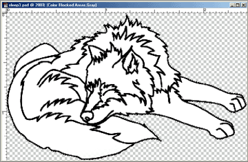
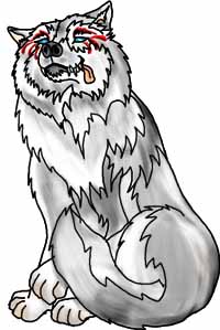
![]()
Okay so you have your line art scanned in. You have three layers to work with, and your original line art is locked as your very first layer at the top of the layers palette. (if it isn't... make it so) *star trek theme here*
Your next task is to make the color fill layers. Select the color fill layer in your layers palette, and then color on the image (or use the paint bucket) to fill in the areas of your image you want a general color.
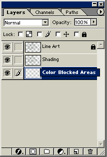
Make sure you have the right layer selected
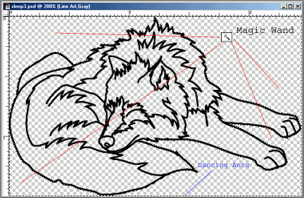
Use the magic wand tool to select the areas around the wolf. Hold down SHIFT and select on multiple regions until everything BUT the wolf is selected with "dancing ants". Then Invert your selection from the menu Select > Inverse or SHIFT+CONTROL+I. (tahdah) Your wolf is the only thing selected. This is useful if you want to keep the color "in the lines" so you don't have to go back and manually erase pixels that were out of the boundaries of your pose.
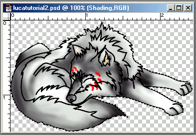
Ok so you have your color blocked in (ok so it was easy, the wolf was white in both places....) Here let me block in the darker shaded regions so you get a better idea of the blocking.

Better? Okay good. ;)
Now you can either duplicate this layer and make it your shading layer, or you can select your shading layer and color on that directly (making sure that layer is on TOP of your blocked in color layers.
Onward.. to shading...
The key to shading is not to be restricted by lines. Okay so there are lines in the poses to give uniformity, but the key is to "Sculpt" the color into the pose, rather than fill in lines and shapes with dark around the edges and calling it done. Remember that lighter colors stand out and thus come "forward" and darker colors indicate depth "further back."
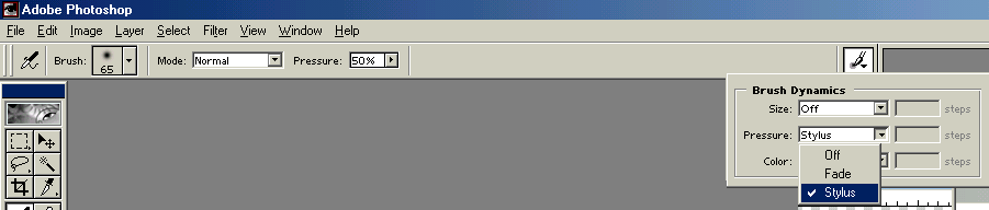
I use the airbrush, usually set to 3 brushes up from the smallest setting or larger for the colors I want to "haze" onto the wolf. If you look up to the toolbar (or to the palette for you 4/5 users). Set your brush to whatever you feel comfortable working with. When I work at 150-300 dpi or so, the brush needs to be "bigger" to even be considered small on high res pictures. For those of you mouse users out there, set the pressure of the airbrush manually. Try 50% or lower and then layer slowly over the area back and forth. For those of you blessed with a stylus, make sure you have the stylus set to pressure sensitive in PS and go to town. ;)
![]()
I tend to whisk my airbrush over the next to lightest colors first and work my way to the darkest last. Sometimes I want to know where my darkest darks are going to be, but usually I go from lightest to darkest, and then highlight. To start, try your next lightest color and work up to the darker ones last. Haze the colors over at 50% or less (or a very light sweep with a stylus) and build your colors like a sculpture.

As you can see, the area right behind the wolf's head is darker than the colors on the head itself. The rear leg is darker than the one in front. The area between the legs is darker than the gray of the legs themselves. The areas between the digits of the paws are darker to indicate depth. It is all about making the illusion of 3d out of a 2D medium. From here you can keep shaking areas until the areas you want stick out more and the colors are to your approval. Don't be afraid to make something you liked different when it no longer fits what you have in the rest of the drawing. The drawing above has a light head, and I decided the dark head fur needed to go in. It's a matter of what meets your aesthetic, and that doesn't always mean following the lines or even what you've drawn 15 minutes ago. Coloring is malleable, like paint. If you make mistakes, paint over them, if you made an oops use undo or the history palette and drag your "oops" into the trash. Go back to a snapshot if you took one. Experiment. It really is the best way to learn something. One of the best painting teachers I've had said if you aren't working hard at it, you aren't doing it right. Art is like that and so is pose coloring. That doesn't mean you can't have fun doing it though.
Okay... Are you done shading? Or as done as you think you'll ever be? Let's move on. (Don't forget to save your work so far - try a different file name)
With the pose colored the way you like, time to resize it to where you can actually use it on Wolfhome.
Resizing that Pose!
First take a pose that you know has already been accepted that has a similar theme to the one you just drew. This one will obviously not be sized with the standard Crinos pose. Goto

Take note of the Pixel Dimensions on the pose that was accepted previously. That is the goal you want for your new pose. Let's stick with Width as our sizing of note and try changing or image size on our new colored pose.

Whoa... shrinkage....
Check your pose to make sure it is still detailed enough that you can tell what it is. There are some pictures and shadings that will definately get worse when resized. For example:

The detail of the head gets "lost" when resized. Take this sort of effect into mind when you make your poses, as the small size required by wolfhome may not make a pose that seems wonderful in a larger colored format seem very good at all.
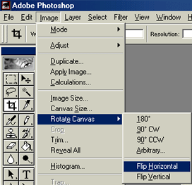
Onward to Transparency!
Photoshop 6.0 has this wonderful feature called "Export Transparent Image" that is separate from the File>Export> (Trans GIF) that is in Photoshop 4+
![]()
Since your file was already on a transparent background, the wizard will take that as what you want transparent and export you a .GIF.
There are also plug-ins such as HVS ColorGIF that can be found at http://www.spinwave.com/ that does very well in optimizing colors so the uploader doesn't EAT the pose as badly. Sometimes one or the other is better. It is entirely up to you how you get from the colored graphic to the GIF format.
Next take that GIF you just exported and flip it over to make your opposite side, and rename it to the appropriate name. Thus:
whateverposeL.gif will be whateverposeR.gif respectively.
That's it. You know have two colored poses ready to upload to Wolfhome. Hope this helps.
-Jhereg